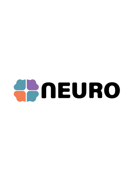
NEURO Rebranding Concepts
Programs Used:
Adobe Illustrator, Adobe Indesign, Photoshop
Project Origin:
NEURO logo redesign
Purpose:
Redesign
Year Created:
2026
How it started…
In my deep-dive of the company I discovered, NEURO is on a mission to make neuroinclusion the norm. “Driven by their experience, and professional expertise NEURO is passionate about making sure neurodivergent individuals should not be accommodated but empowered to thrive in areas on society.
With this in mind, I began by identifying five keywords that best represented the company's brand identity. Those word were welcoming, equality, inclusion, safe environments, and science. Using these core values as a foundation, I first created a mood board to establish a visual direction, and then started sketching, and exploring a variety of visual concepts that could effectively communicate the organization's mission, and personality.

Color Palette
I wanted to make sure my design communicated inclusivity, diversity, calmness, and clarity, and by doing so it would support our message. Subtle enough where It doesn’t convey a harsh aggressive look but vibrant enough to demand attention. The color palette that supports this idea was pastel color theme.
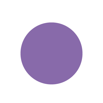
Teal = Balance, and understanding
Lavender = Neurodivergent identity
Soft Orange = Warmth, and creativity

CYMK: 61.82, 28.44, 26.19, 0.41
RGB: 103, 154, 172
HEX: 689aac
CYMK: 0, 0, 0, 100
RGB: 0, 0, 0
HEX: 000000
Typography
Design and Lockups
When researching for typefaces, I was looking for something that was easy to read while maintaining consistency with the logo/mark. In this case, I went with Acumin Variable Concept. It generates a bold yet appealing presence delivering a professional attention grabbing look.
I added a slight curve to the typeface to fit the design of the logo (brain). With the curvature added it adds a sense of calmness and a scientific appearance.
Acumin Variable Concept
ABCDEFGHIJKLMNOPQRSTUVWXYZ
abcdefghijklmnopqrstuvwxz
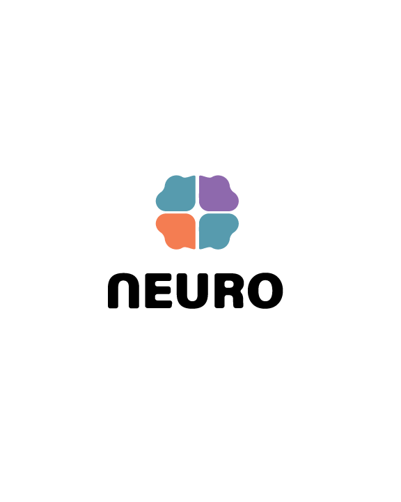
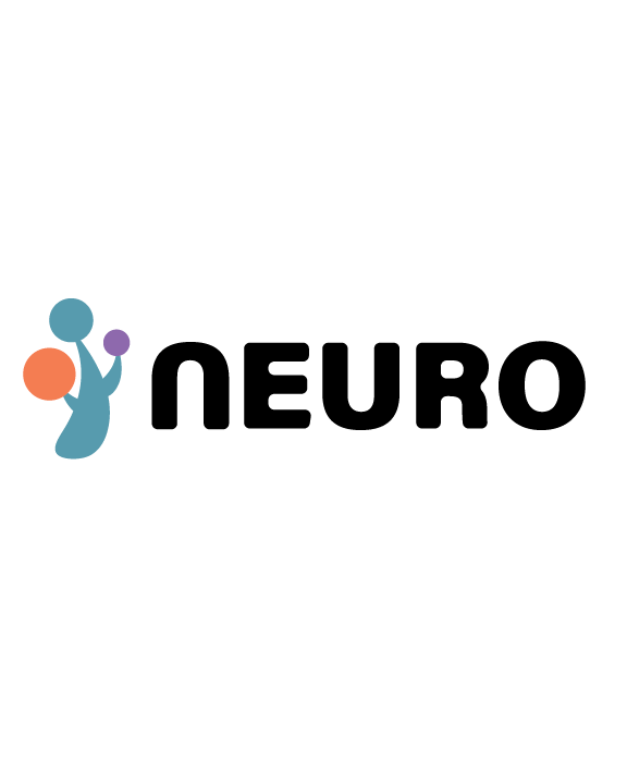
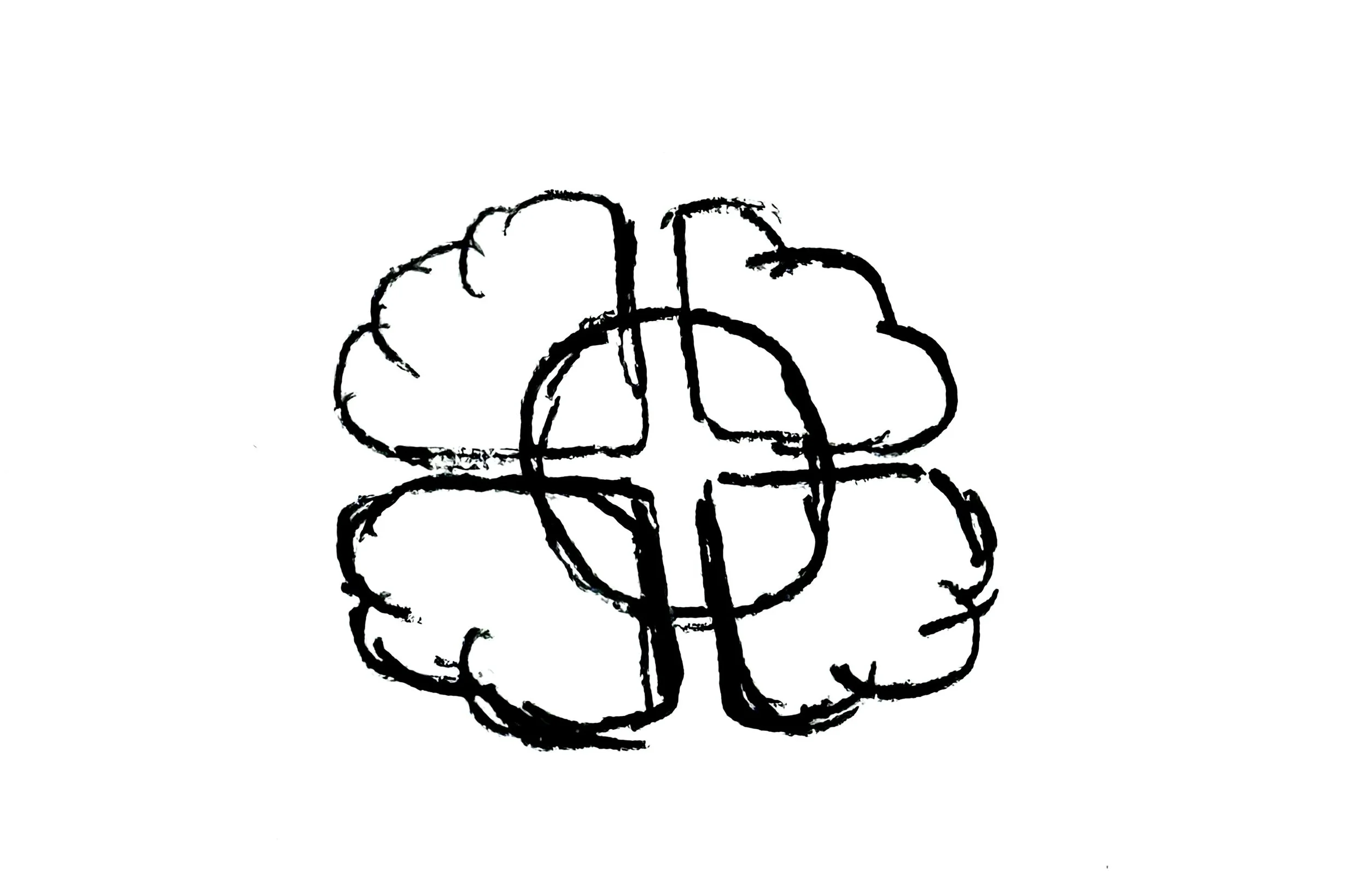
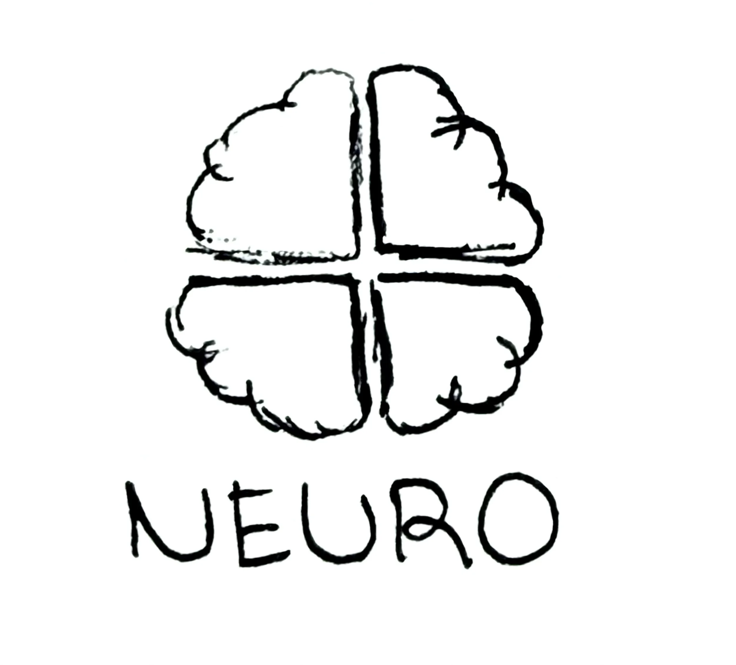
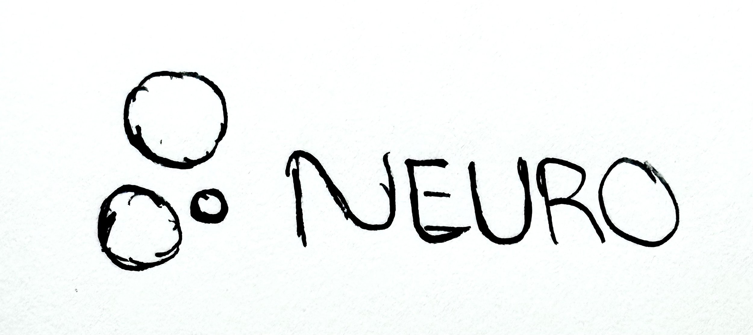
Logo #1
This logo originates from the current NEURO design. My aim was to redesign the logo and modernize it.
With the redesign, I focused on creating a logo that is memorable, scalable, versatile, and easy to read, while conveying a compelling story.
It contains elements of a brain supporting the organizations story.
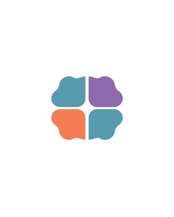
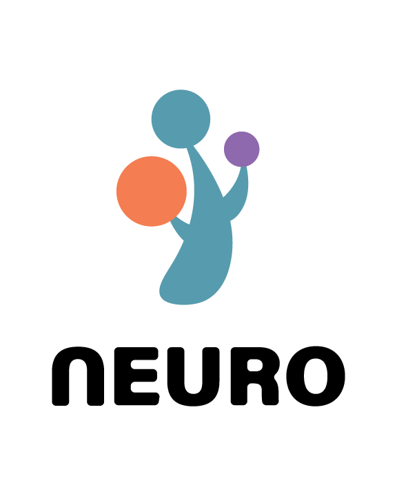
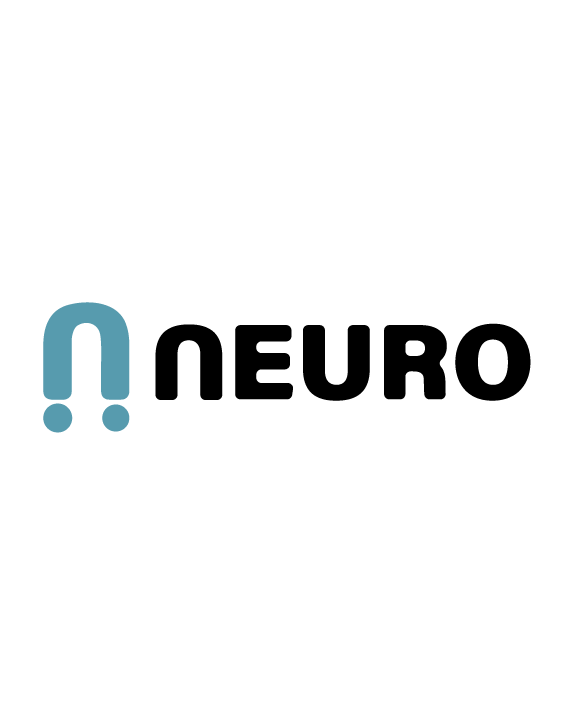
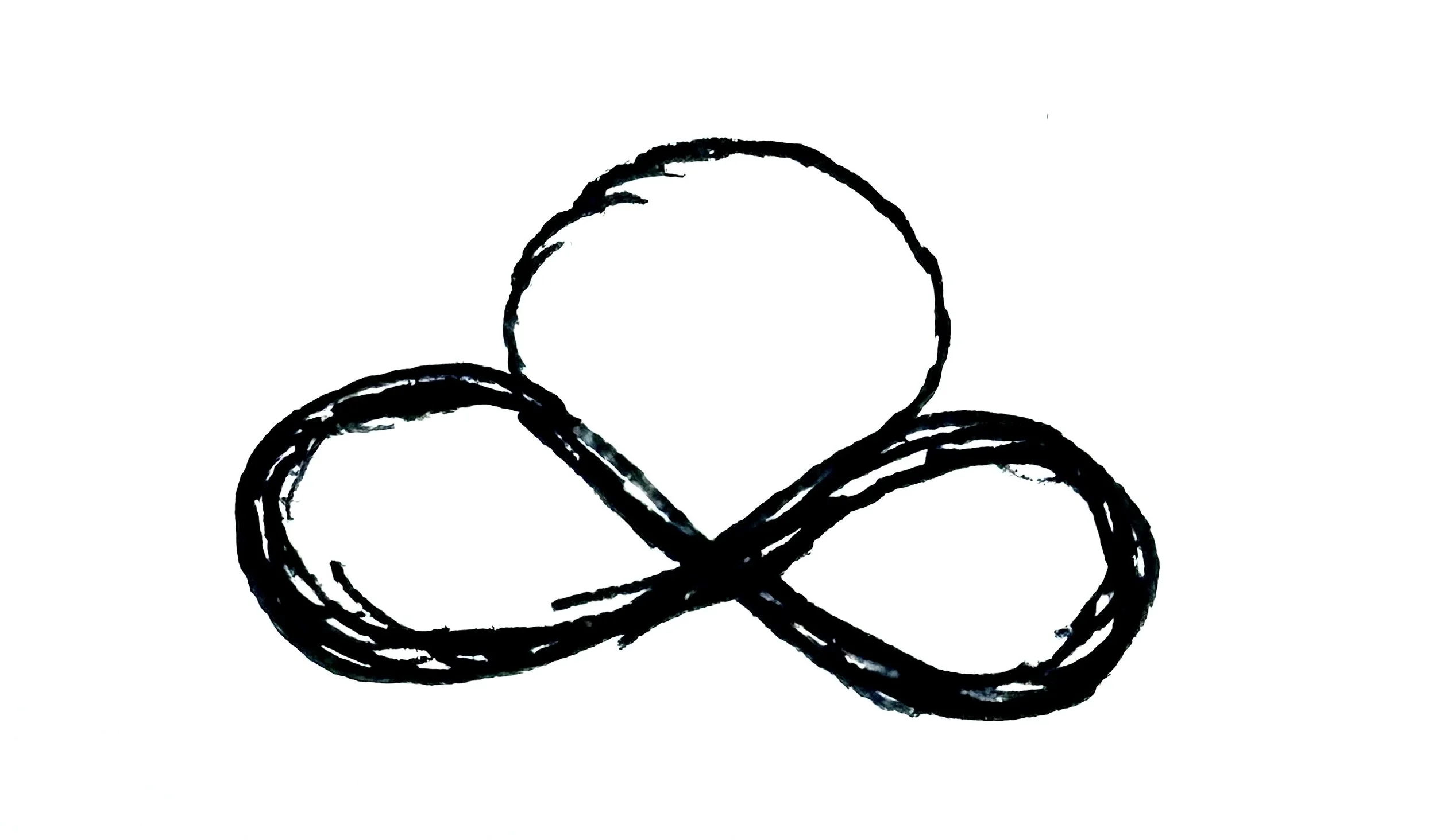
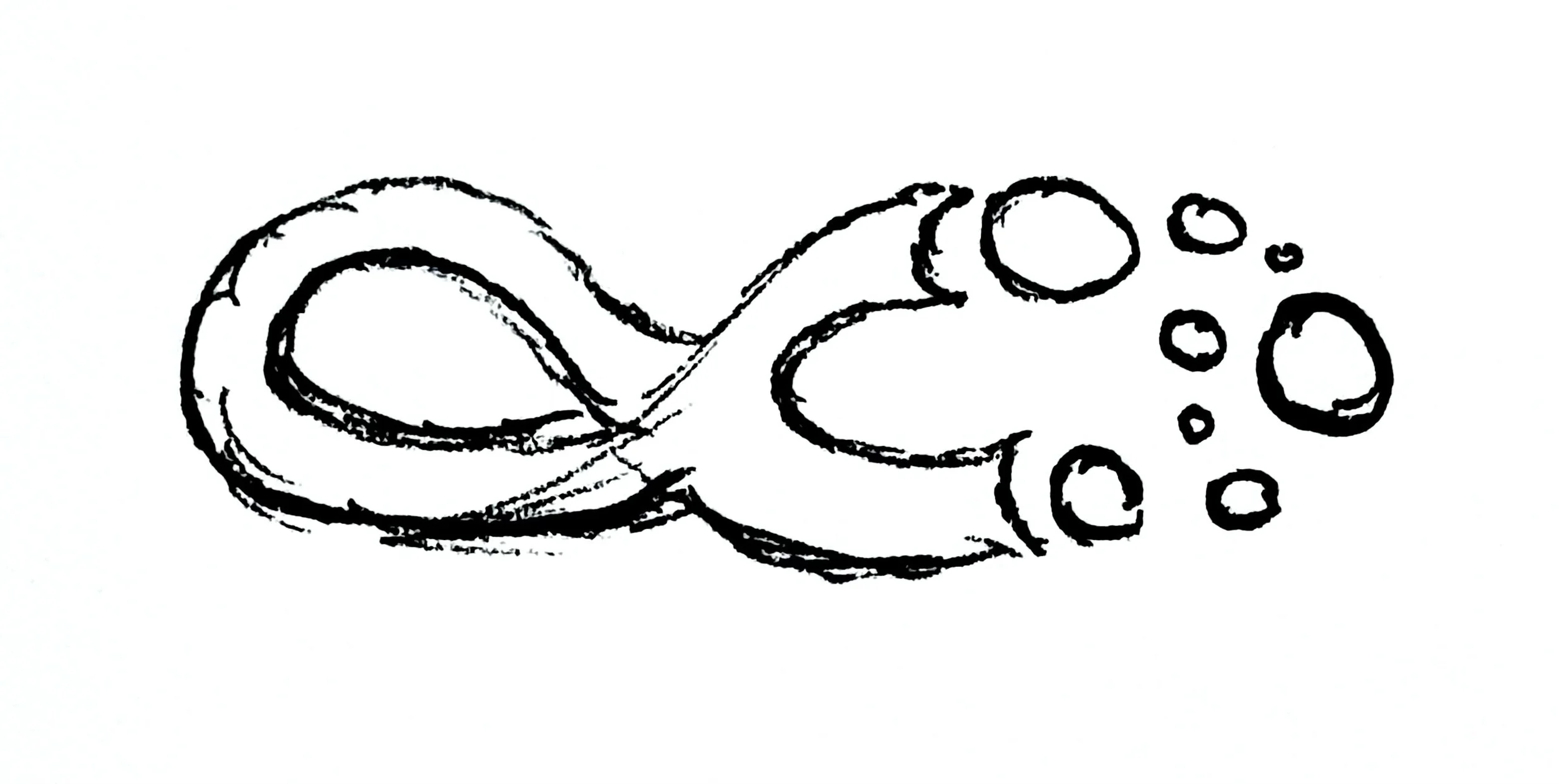
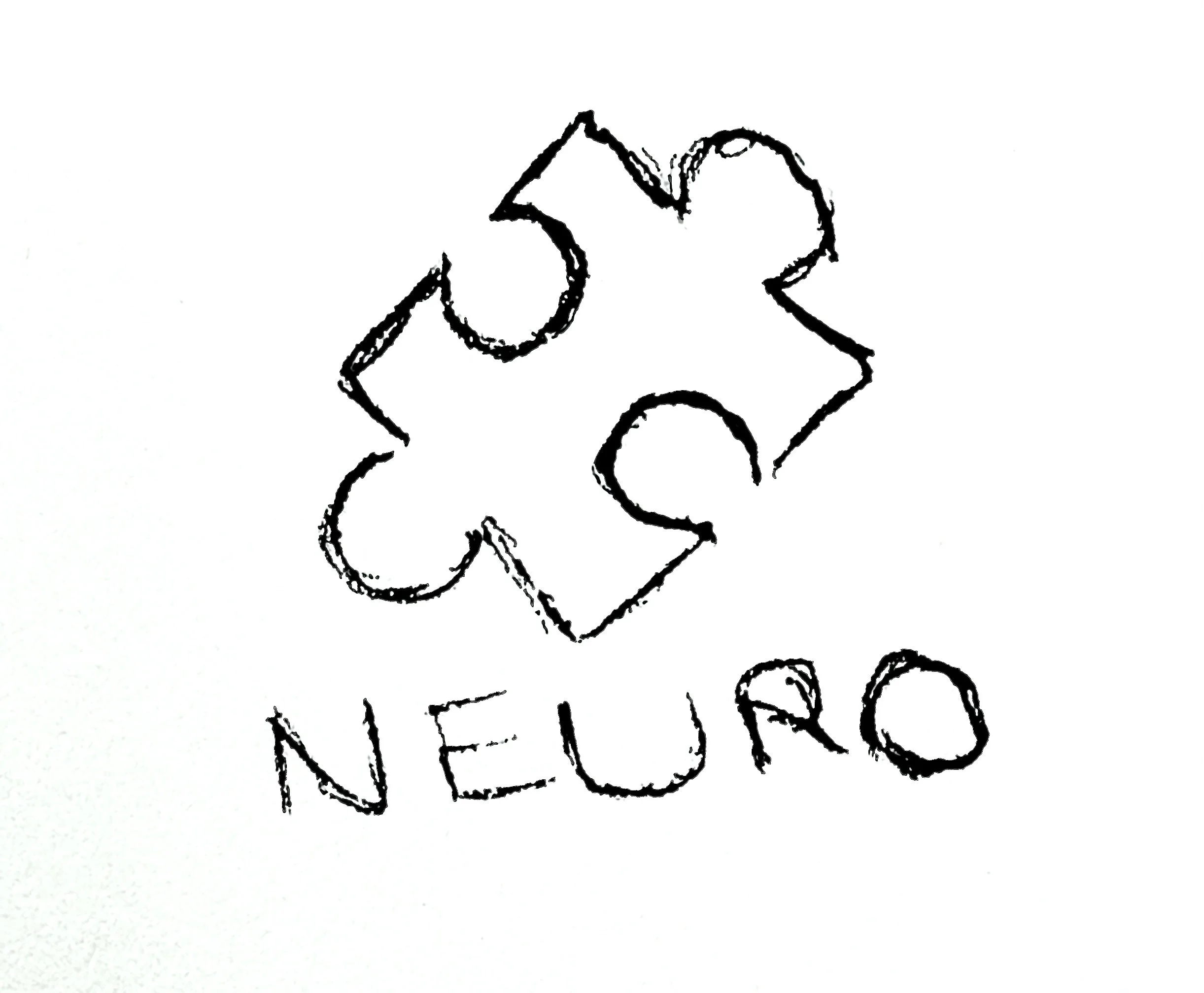
Logo #2
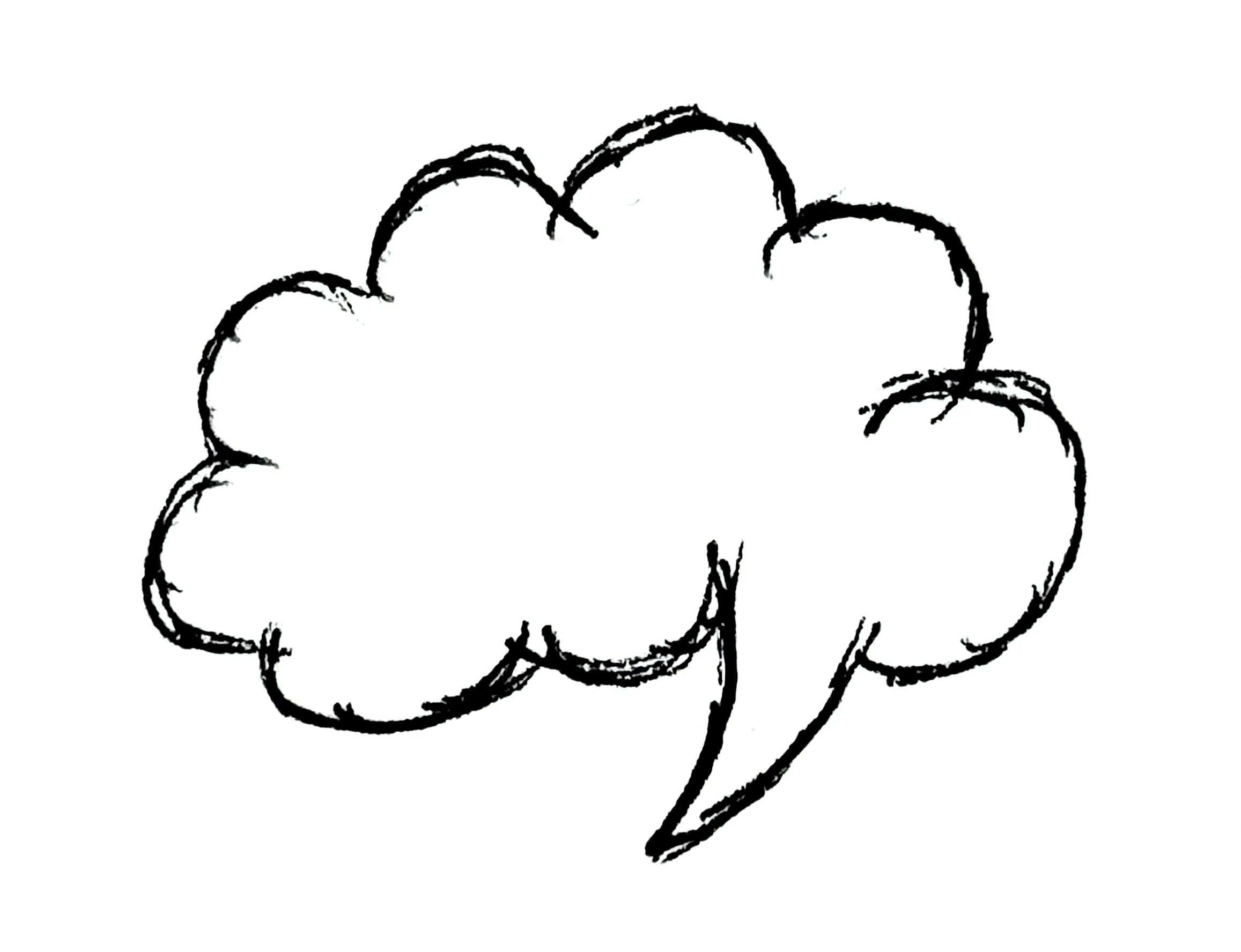
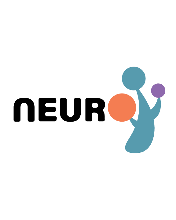
In my research, I discovered the significance of a tree. It often symbolizes resilience, unique growth and sensory sanctuary.
Trees are used to explain that neurodivergent people think and grow differently.
Neurodivergence if often seen as standing strong against societal pressure, navigating challenges and thriving in ones own way.
Nature and trees often offer a safe, calming environment.
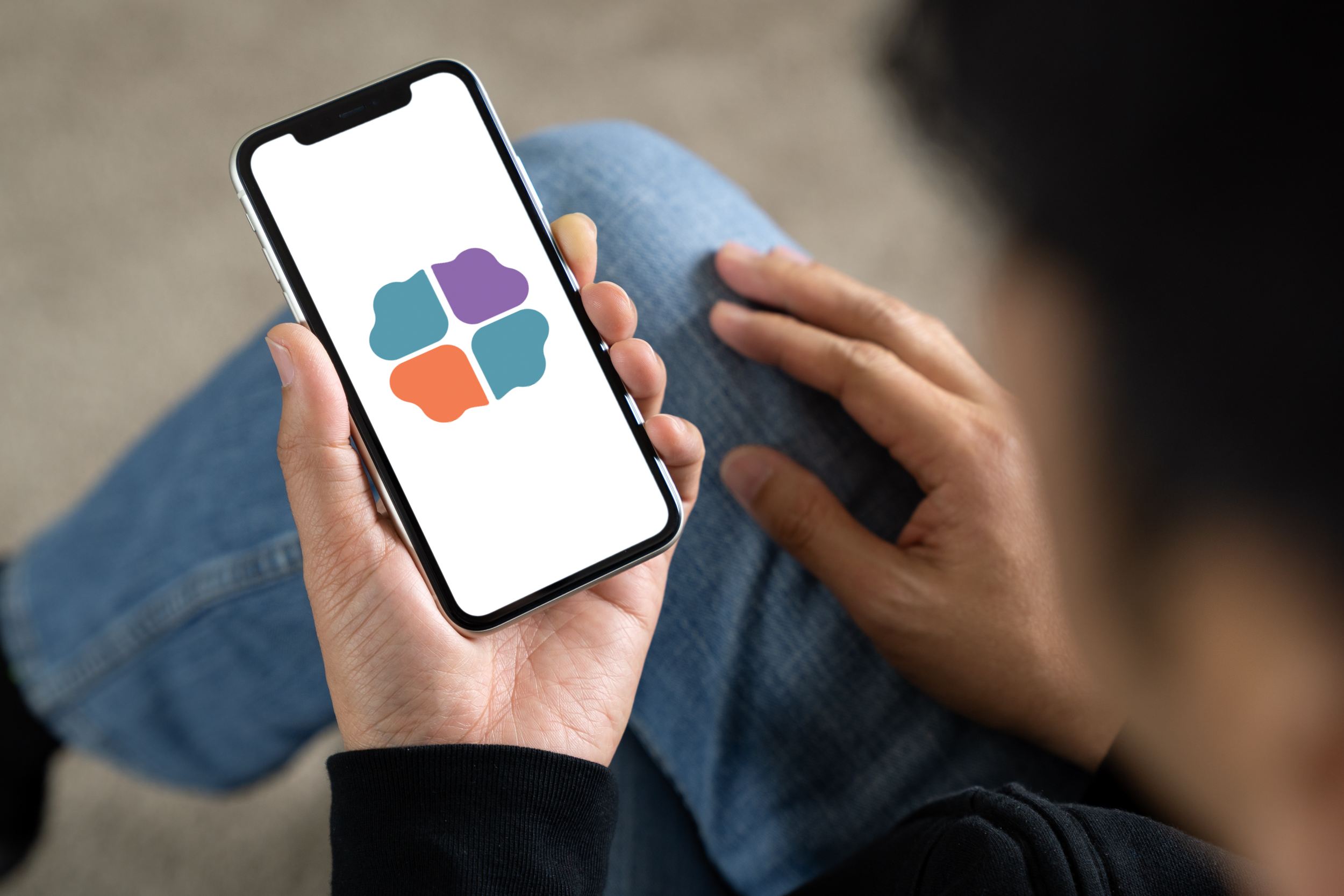
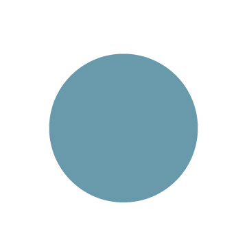
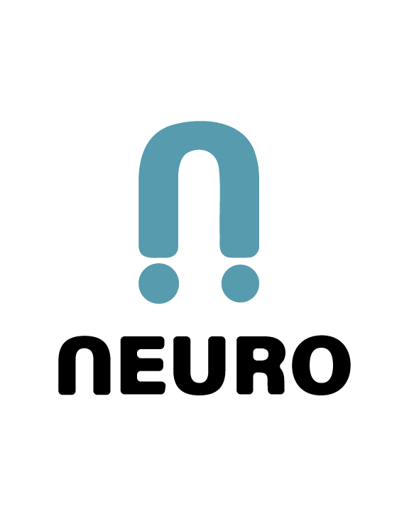
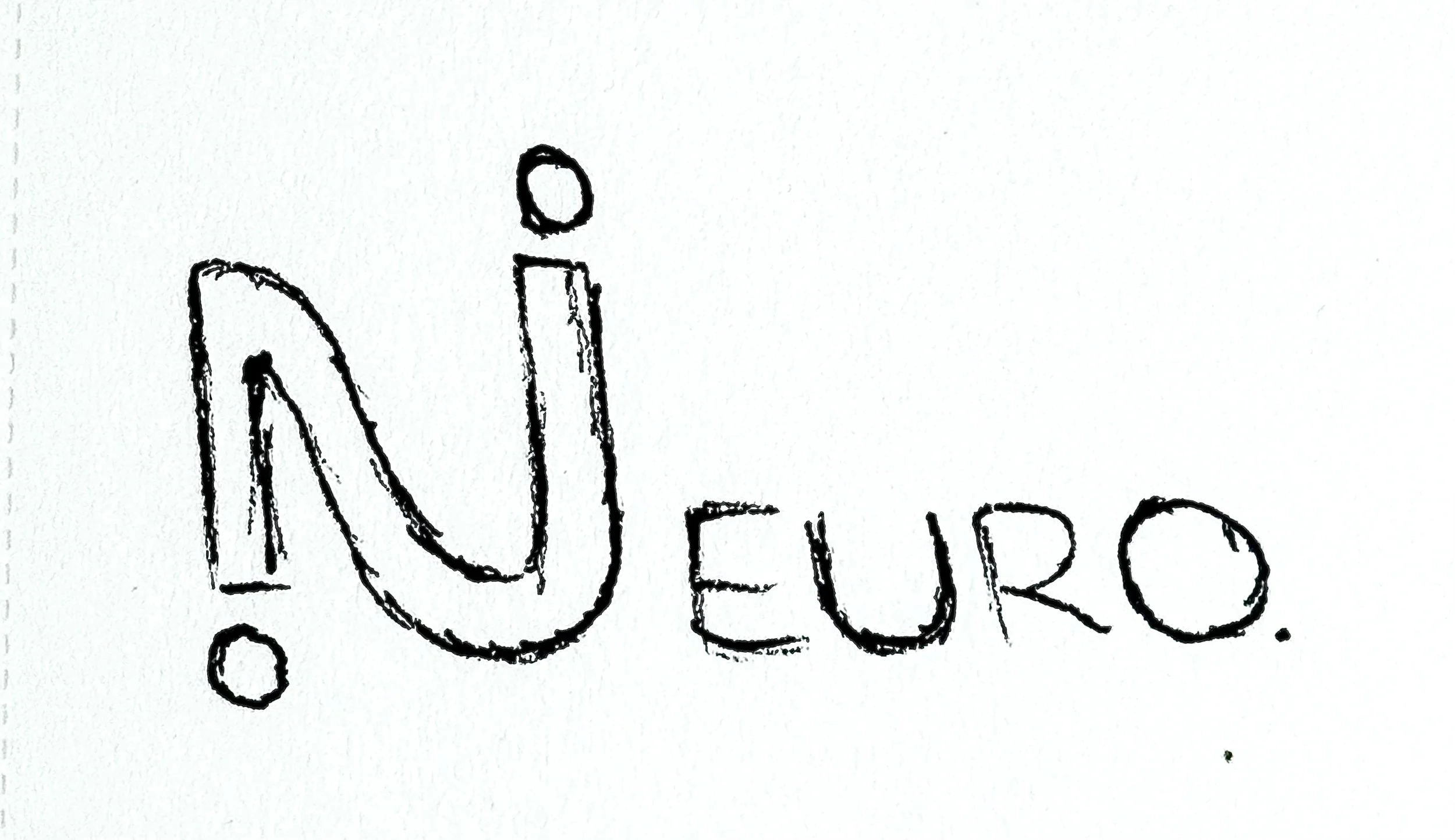
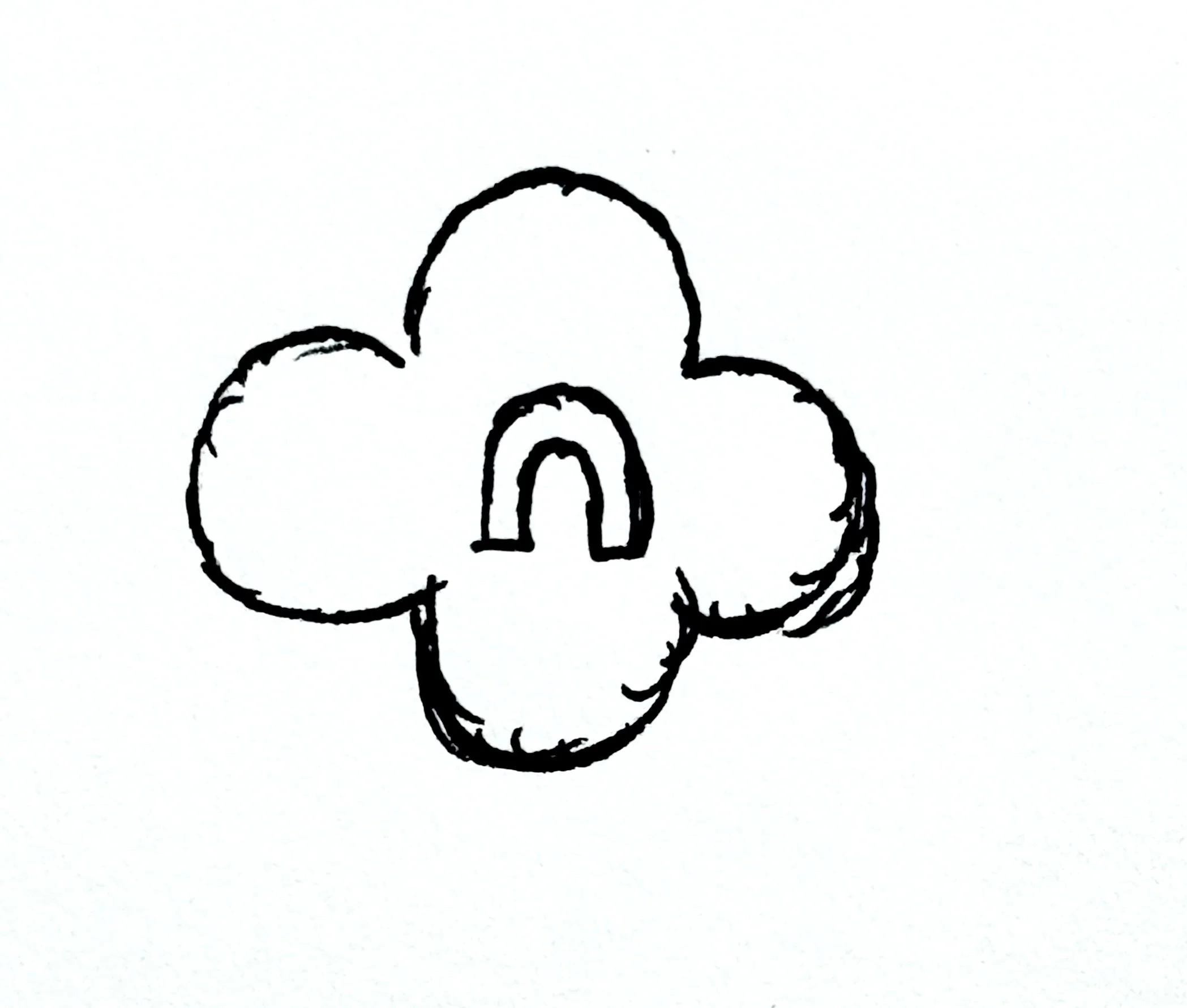
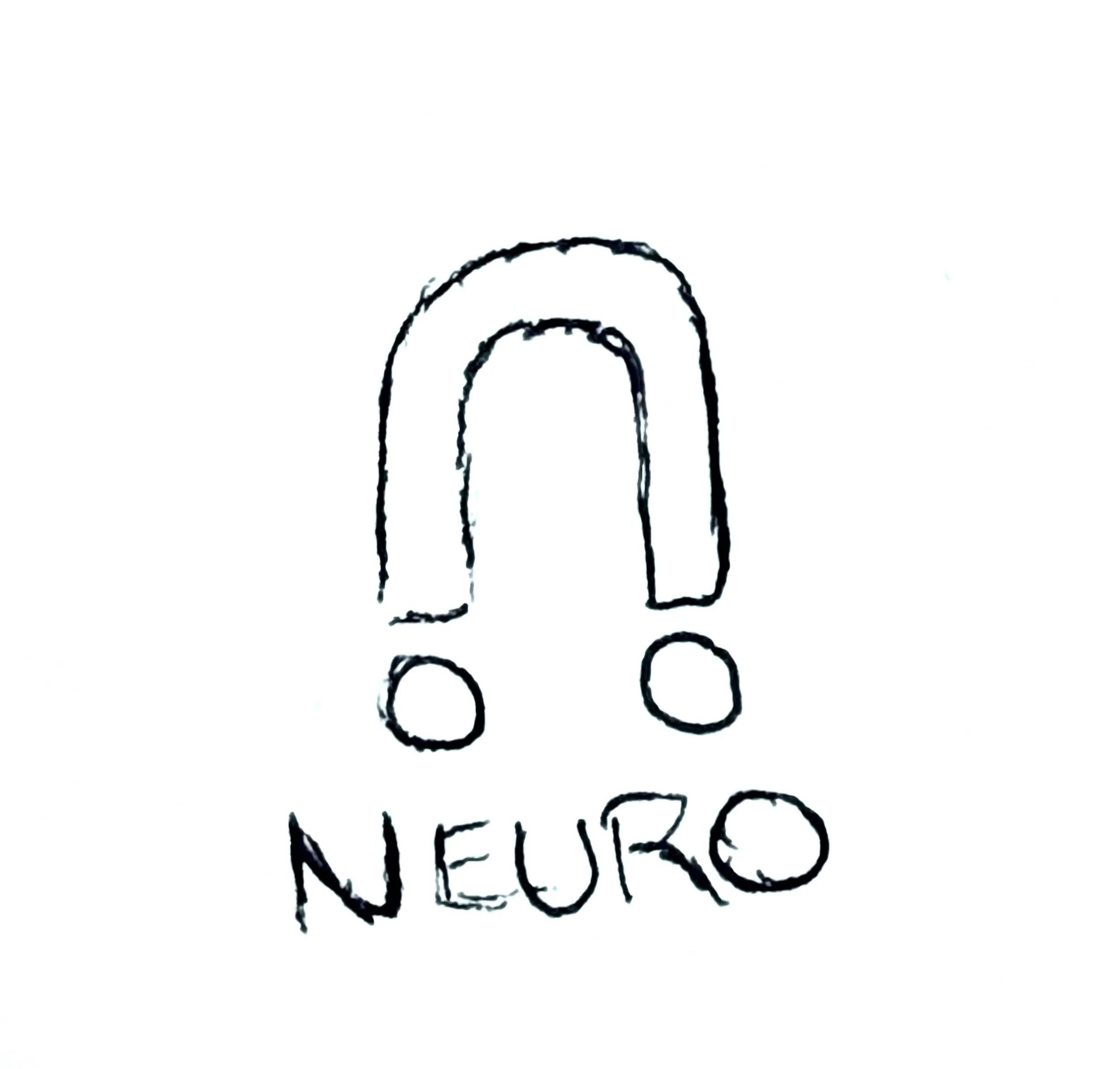
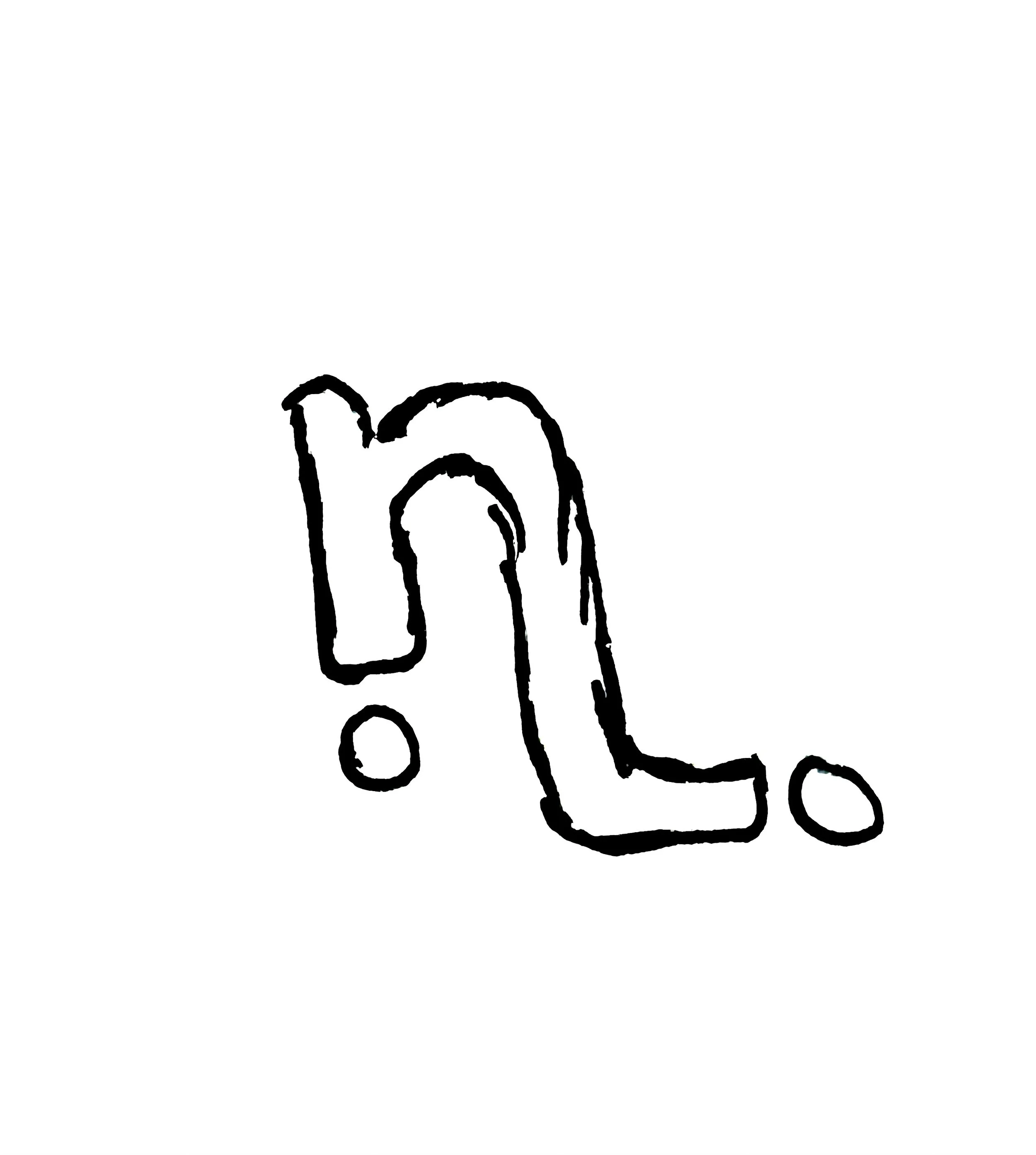
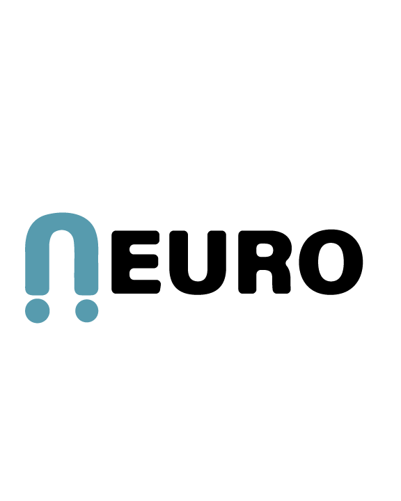
Logo #3
This design takes a more minimalistic approach painting consistency with the typeface.
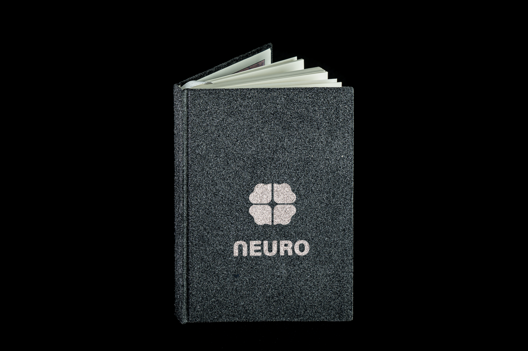
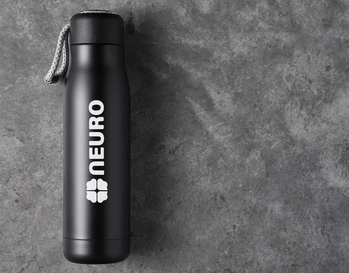
I used the n and added two circles making it symmetrical on both sides. The circles represent same category, different expressions.
Many successful companies follow this type of design such as Google, PayPal, Facebook, and much more.
About:
For this project, I was tasked with creating a series of concept logo designs for the company. This assignment also served as an opportunity to demonstrate my experience and design capabilities as part of the evaluation process for a potential role with the organization.
My goal was to present a diverse range of logo concepts, providing the company with several creative directions to consider. When approaching projects like this, I like to take a deep dive into the company’s vision, culture, and mission. This research helps me create meaningful, strategic designs that not only look visually appealing but also authentically represent the brand’s identity and values.
CYMK: 0, 0, 0, 4
RGB: 255, 255, 255
HEX: ffffff
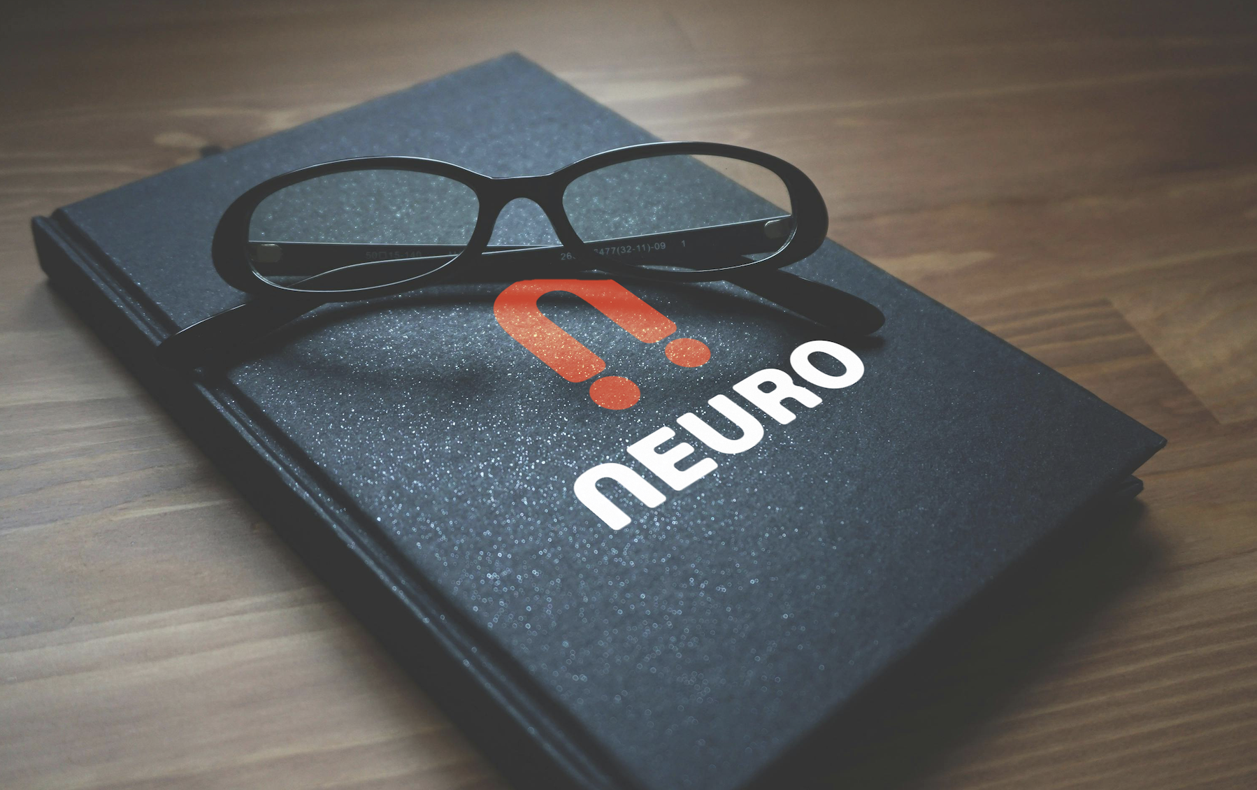
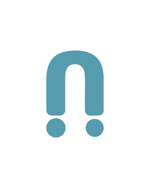
Old Logo:


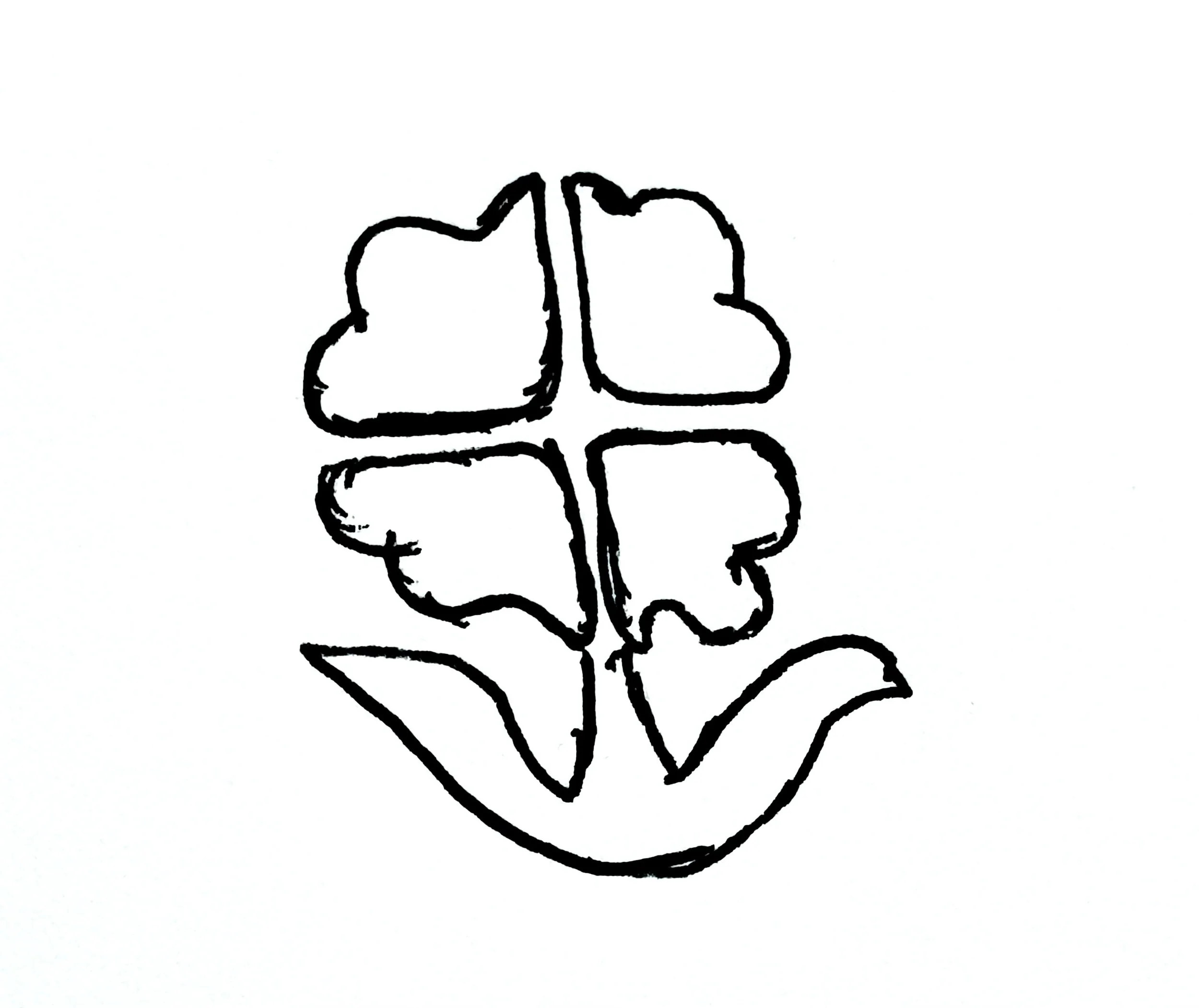
As I sketched these logos I wanted to make sure the logo was unique, sizable and it communicated the company’s identity. I needed the design to stand with a strong visual presence and have a professional appearance.
CYMK: 52.02, 65.35, 3.38, 0.02
RGB: 136, 106, 169
HEX: 886aa9

CYMK: 7.15, 57.97, 67.87, 0.1
RGB: 229, 132, 93
HEX: e5845d

The n and u are used to remind the viewer of inclusivity and equality. Even though we have our differences we are all human.
This organic mark manages to keep the original identity along with showing its versatility.
The two teal colors serve as a reminder that although neurodiversity includes a wide range of experiences, we are all the same and capable of thriving within society.

This organic mark delivers a science like appeal symbolizing nature, growth and diversity. It also resembles a brain stem.
I wanted this design to be unique so I moved away from using a generic tree and added a twist instead.
The organic mark delivers a different type of logo by using a single letter representing NEURO.
The mark shows its versatility with the capability to change into many colors and sizes.

Environmentals