Dweller Auto Detail of Zion LLC
Programs Used:
Adobe Illustrator, Indesign
Project Origin:
Detail Company
Project Purpose:
Company brand and idenity
Year Completed:
2025
How it started…
In approaching this design, I aimed to incorporate elements that reflect the identity of a car detailing company. My primary objective was to create a logo that not only tells a compelling story but also distinguishes itself through a unique and memorable way.


Going Digital…


Typography
CYMK 0, 0, 0, 4
RGB 255, 255, 255
HEX ffffff
Digital Iterations


As I researched different typeface’s I wanted to make sure it had a clean, gentle feel, nothing too rigged to evoke a calm polished design. Most importantly I wanted it to have readability. The type should be easy to read even on a moving vehicle.
I ended up choosing Adelphi PE Variable because of its versatility and cleanliness and for information on business cards I used Brothers 1816. Customizing my typeface I added a slight curve to my font making it a bit bubbly to represent bubbles but at the same time getting rid of the strong pointy appearance. This will end up supporting the organic design the logo has.
For my color palette I went with a blue color scheme. The blue represents water, cleaning, and professionalism. Choosing the color is important because it helps bring the identity of the logo design to life.
CYMK 91, 74,0, 0
RGB 45, 86, 166
HEX 2e56a6

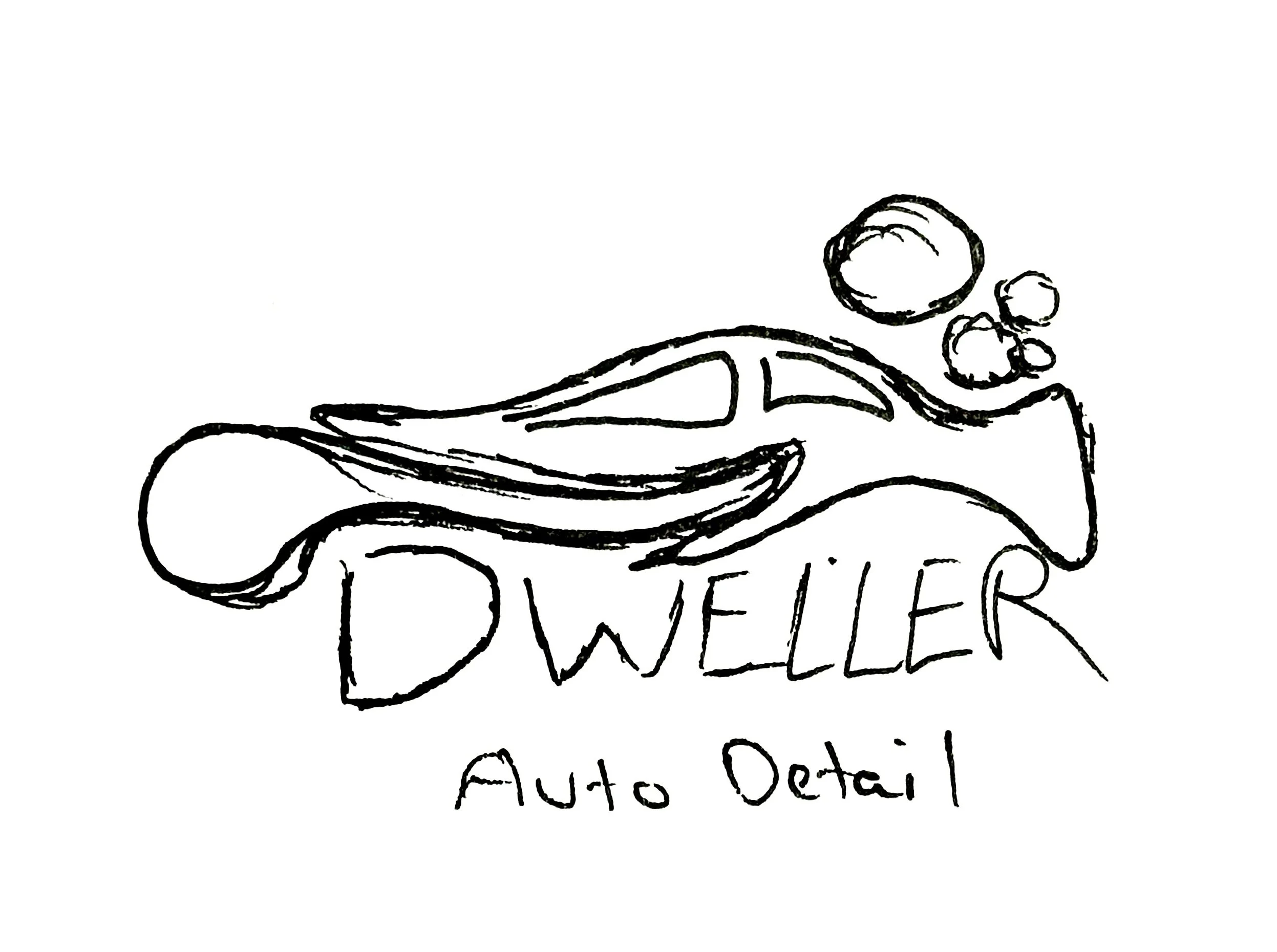
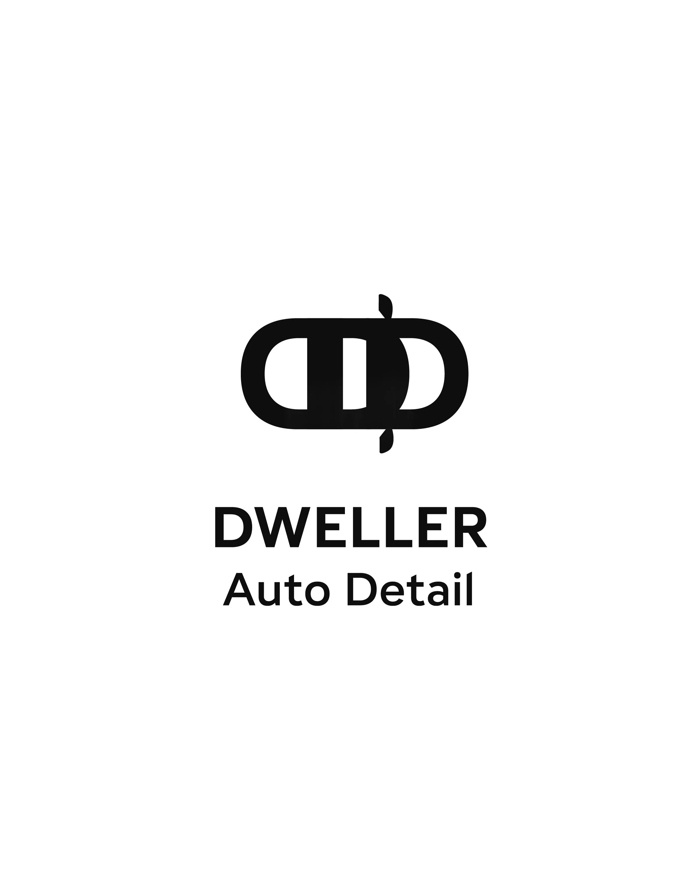
Talking with my client we decided to proceed forward with the water droplet design.
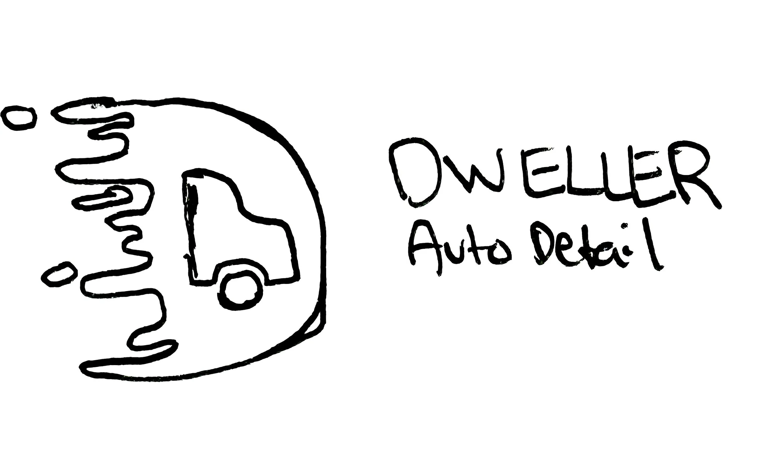
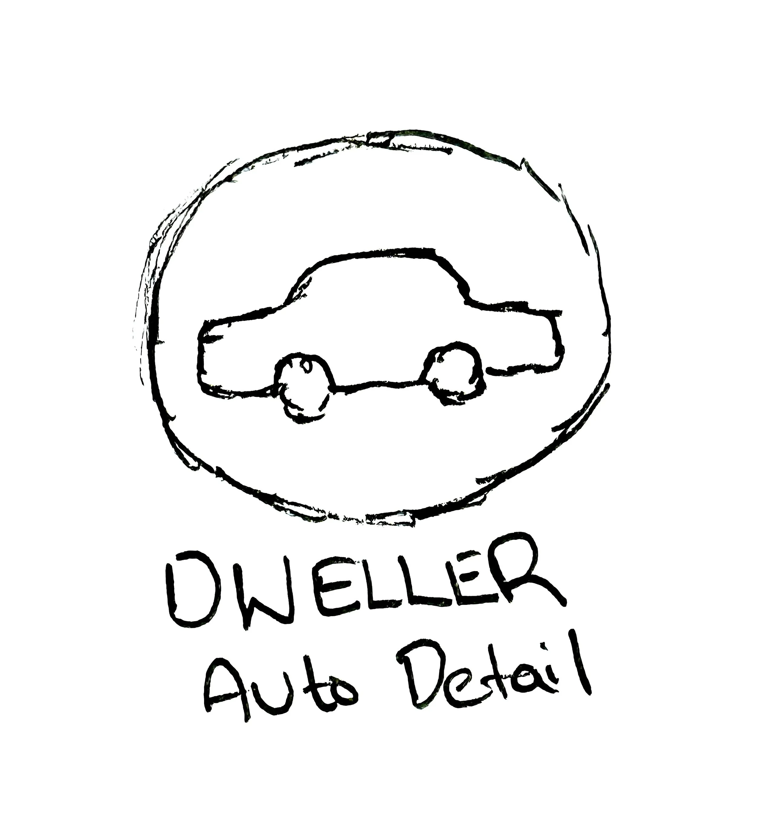
I integrated a vehicle into a water droplet. I didn’t want to put a full detailed car into the design because it would lose the uniqueness. The stars help represent cleanliness but also symbolizes hope and guidance in a religious aspect.
The alternate designs show the versatility of the logo and also keeping the soul identity of my style. Each lock up has a unique look for different scenarios.

For this project, I was tasked to create a design with a primary focus on automotive elements, detailing, professionalism, and religious beliefs.
The project contained, business cards, shirts and other concept ideas for future use.
During my ideation and research the client would tell me the company name is inspired by christianity.
Drawing out my sketches I had the idea of taking a minimalistic organic approach.
Each logo needed to be sizable, versatile, and memorable. The client requested, to integrate a car into the design.


The challenge I came across was adding a vehicle onto the design without looking generic. To avoid this dilemma I incorporated parts of a vehicle and gave it an organic look to meet the unique appearance.
Some of these designs would not end up working because it was too difficult to understand the meaning behind the logo. In some cases I implemented some stroke effects to convey the act of wiping.

Color Palette


Final Design and Lockups

Adelphi Pe Variable
ABCDEFGHIJKLMNOPQRSTUVWXYZ
abcdefghijklmnopqrstuvwxyz
Brother 1816
ABCDEFGHIJKLMNOPQRSTUVWXYZ
abcdefghijklmnopqrstuvwxyz
CYMK 0, 0, 0, 100
RGB 0, 0, 0
HEX 000000
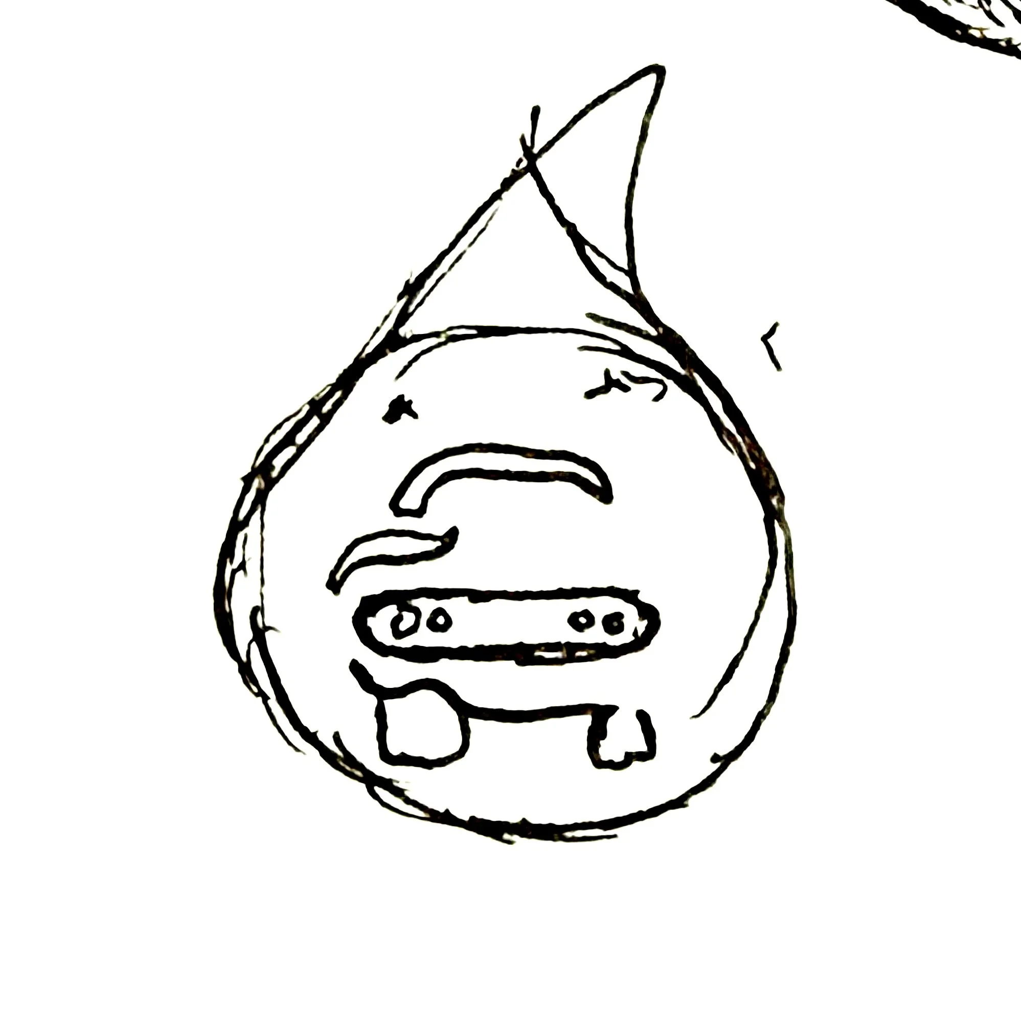
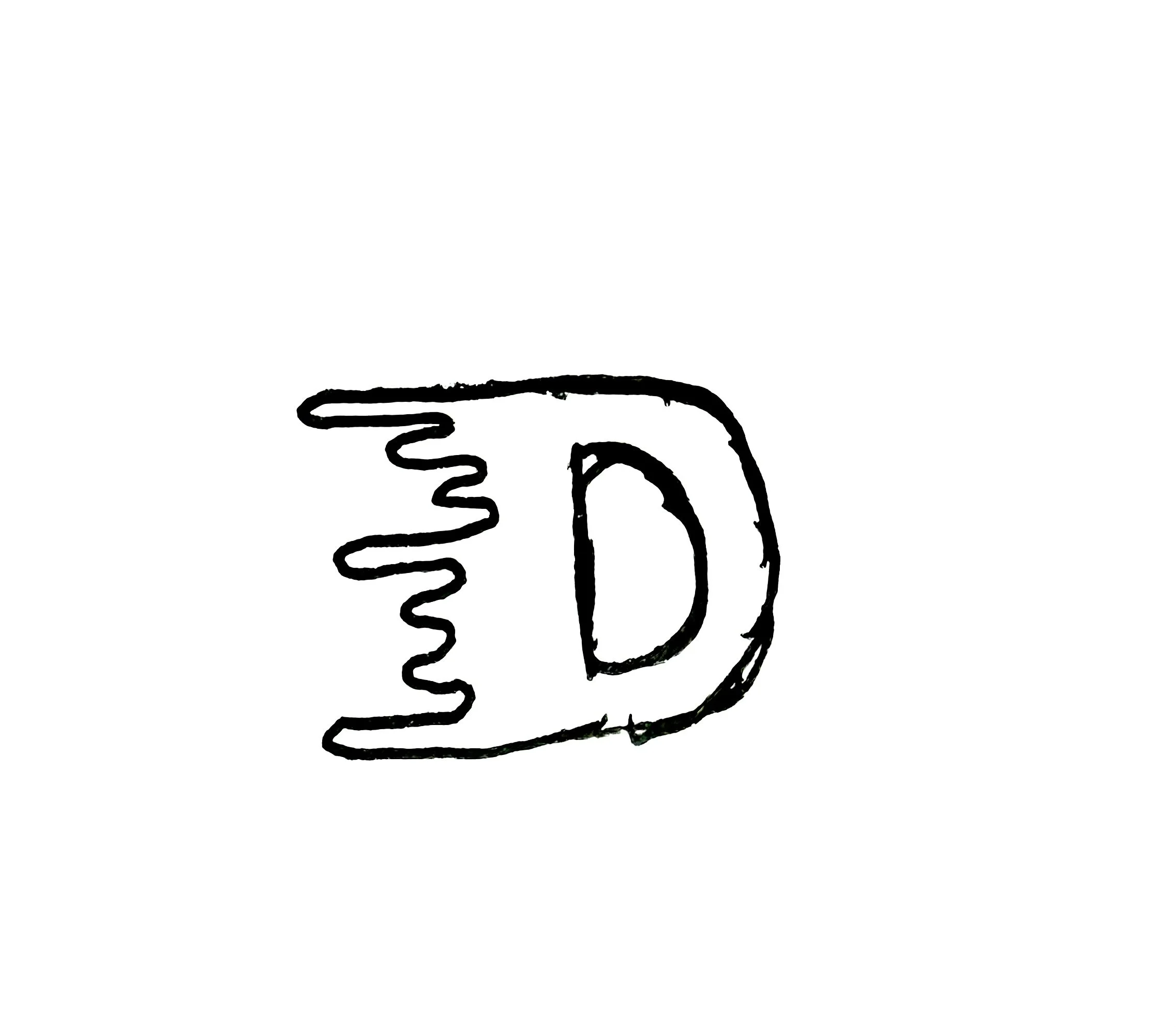
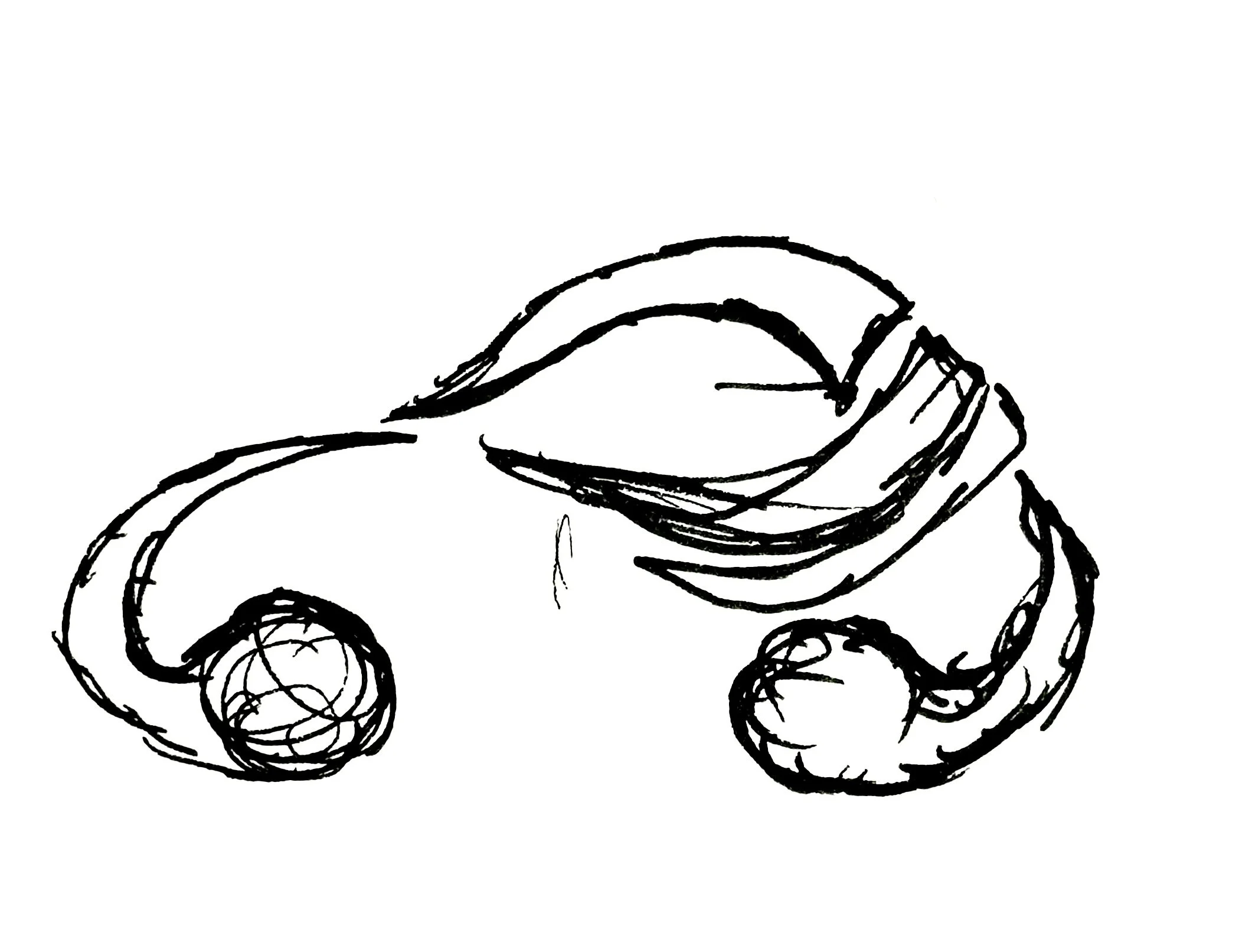
Experimenting with the droplet, I didn’t like the pointy design. It was too harsh and the star outside made it look like a laughing face. I wanted the drop of water to have some movement as well reason why I moved away from having a basic water droplet design.


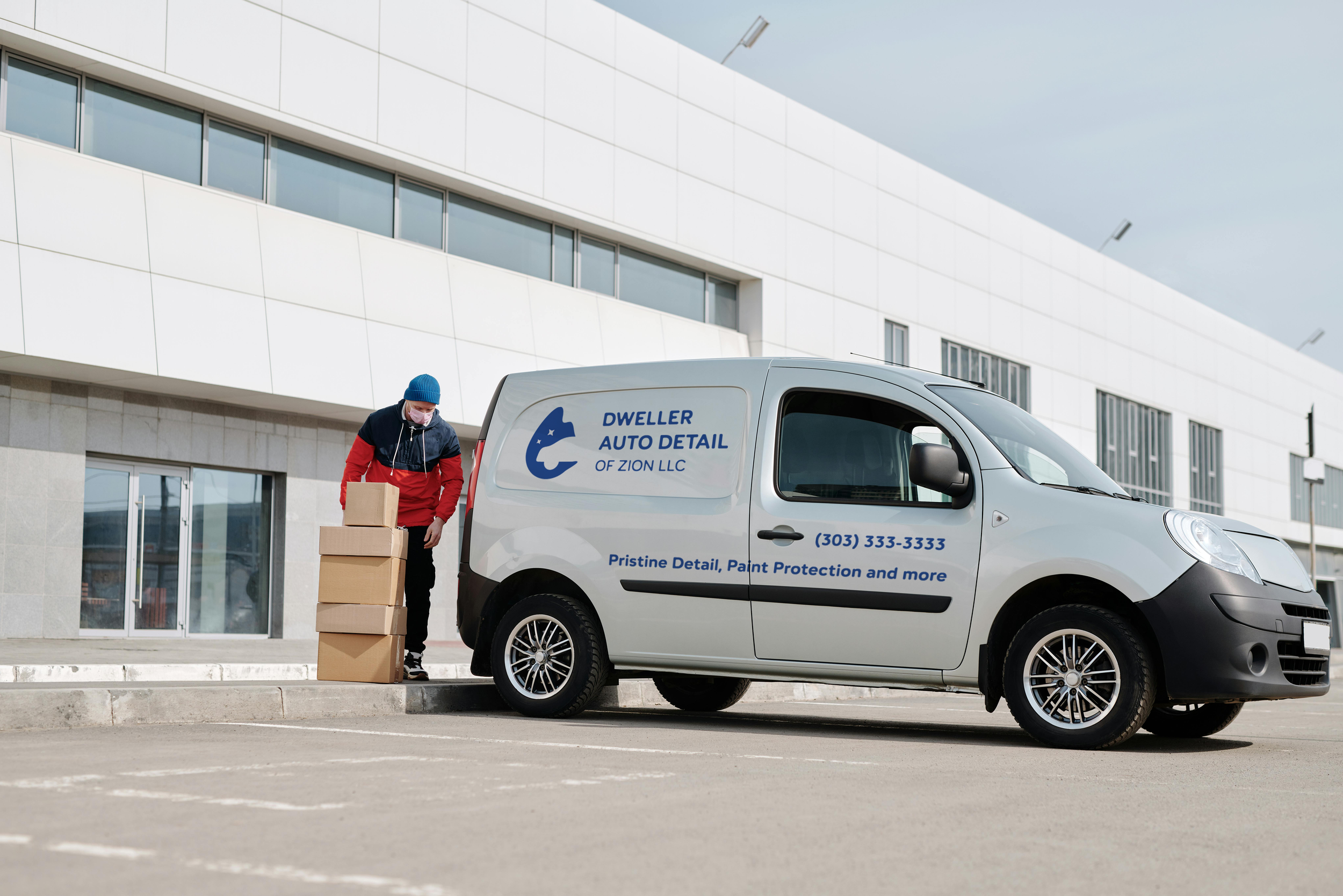
Environmentals